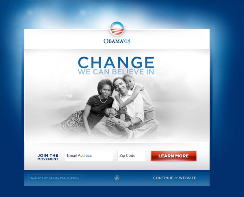
A great post over at Optimizely on how they used analytics to improve the Obama campaign. They ran all sorts of combinations on a splash page asking people to sign up for their newsletter. The difference between the top combination and the bottom combination was 3% conversion, from 8% to 11% . According to them, they learned;
- Every visitor to your website is an opportunity. Take advantage of that opportunity through website optimization and A/B testing.
- Question assumptions. Everyone on the campaign loved the videos. All the videos ended up doing worse than all the images. We would have never known had we not questioned our assumptions.
- Experiment early and often. We ran this experiment in December of 2007 and reaped the benefits for the rest of the campaign. Because this first experiment proved to be so effective we continued to run dozens of experiments across the entire website throughout the campaign.
However if you look at the post, and the results, the lessons learned about optimisation should be;
- Use People, the more people you have in the image the better. The more people can connect with the people in the image the better.
- Use non threatening action words. They went from “Sign Up”, a commitment, to “Learn More” a non threatening request for information.
- Use emotive words. The top combination had their slogan “Change you can believe in” which obviously has a stronger brand and emotive connection than “Get involved”.
