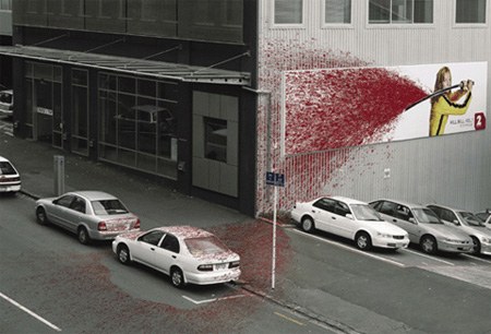
As creative people we would all love to be able to design and execute a billboard like the Kill Bill ad above. However, the bottom line is most of us either don’t have the budget, don’t have the time or don’t have the brand. Billboards can be a very potent marketing material that will attract a lot of attention, create a lasting impression and allow you to convey something on a large canvas.
In Sydney a billboard like the one on Fairford Rd, Bankstown (operated by ooh) would get a reach of 60,000 and a frequency of 6, meaning that your message will certainly get across and be reinforced in a large audience. One thing is important to remember, no marketing campaigns should be executed in isolation. If you are sending out a message using a billboard, you need to back this up with the same message in a wide variety of other media. Because billboards are passive, you can’t rely on the customer to pick up the phone right away, you need to make sure you are catching them in a range of other areas.
Billboards are one large canvas, and vision trumps all other senses. Tell the story with an image first, and then worry about the copy second.
One image one point
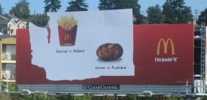
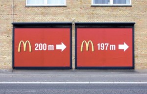
Most billboards are by the side of a road, so you will have about 5 seconds to get your message across, slightly more if they are stuck in traffic. Don’t get stuck on trying too much copy, too many ideas, or too many calls to action. These days a brand and a web address is the most you should be aiming for. The McDonald’s billboard above is a clear indication of the power of all of our design principals.
Be memorable and generate curiosity
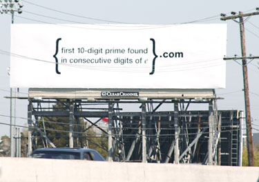
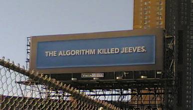
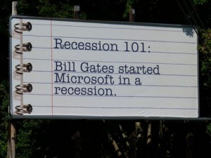
The two billboards above are both by search engines, aimed at trying to get you to search for these terms online. The top billboard was created for Google for their recruitment drive. The bottom one was created for Ask.com’s search engine. The bottom one caused enough people to want to search for the term, XKCD, a geeky comic, jumped on the bandwagon and used SEO to ambush the terms.
The bottom line is, people don’t have a lot of time. You need to catch their attention, be memorable, and get them to take action. Using search terms like the ones above are a good way, but they might not suit every brand.
Its all about type
Once you have your imagery lined up, you need to get your words right. We would suggest 10 words, at the most, including your brand and your call to action.
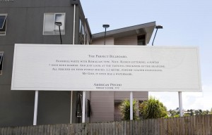
The American Psycho billboard above uses a lot more type, but that is the point. They want to suck you into the call to action at the bottom.
Use contrast
You can use contrasting imagery, or just contrasting colours to prove a point. Either way be bold, make your point stand out.





Great examples. Being in the search marketing agency space, we aren’t generally big fans of billboards; based mostly on the inefficient tracking & interaction of the medium.
Having said that; these are great examples of how the medium CAN work. As mentioned in your post, most people don’t have the money, the time, or the creativity to execute successful campaigns using billboards.
I would suggest that any marketer that stumbles onto this blog post should re-read the article with online banner ads in mind. Many of the above examples would make for a great MEME if converted to online banner ad usage.
Thanks for the great blog!